Thursday 17 November 2016

Negative Painting....Aaaaarrrggghhhh!!!

I teach this concept at every class I do and though it was something I grasped in the early days, I never grasped when best to use it so it was a tool at my disposal which I promptly forgot about. It wasn't until I really started to improve that I began to understand the significance of what an important technique this is.

Good painting is about having a variety of aspects so colour, tone, shape, line etc (and having repetition as well) and of course edge. Edges can be soft, lost, found, positive and negative.

Here is a definition I found from Craftsy

"Negative painting is a simple technique that involves applying pigment around an subject to give it definition. You'll add paint to surround the person, place or object, making it stand out because it appears lighter than the background"

which is pretty much what I would have said about it too. However you don't need to use the technique to make the whole subject appear.... you can just reveal part of it. I mentioned lost and found edges, well it is the found edges which can be created both positively and negatively... the lost edges simply aren't there.  

Will give you some examples......

In the leaf below at the base of the leaf you can see some hard edges formed negatively to reveal the edge of the leaf. Opposite another area of negative painting. The tips are mostly lost and there is a bit of a soft edge towards bottom right. Other areas have been painted positively where I have painted the body of the leaf and created the edge from inside. But the whole subject has a mix of all the edges and not all the subject has been defined.


In the the following example the heads of the sheep have been created by painting the background behind them using a build up of quite dark paint. I have also left a little "halo" around the heads which also helps the idea of pitching light against dark while still allowing me to give some of the sheep dark heads and faces.The bodies have in contrast been "lost" into the foreground and the details on the faces have been painted positively.


In this final example (a Brusho hydrangea) I have again used a variety of edges. Some of the form of the bottom of the flower head has been created negatively if you check out the stem it is clearly painted negatively as it is paler than the bg, and also some of the petals inside the flower. You can also see a little touch of yellow almost in the centre of the painting which just create a teeny bit of form and likewise if you follow the edge anticlockwise to just before "o'clock" you can see another tiny bit of yellow. Those touches just finish the shape physically and our eyes do the rest. If you look carefully at this painting you will see the full variety of edges though fewer positively created shapes than negatively, as hydrangeas tend to be lots of petals hidden behind others so lots of darker shapes


Would appreciate any comments to let me know if this has helped and if you would like another blog with some more examples... I didn't want to bombard everyone with too much information at once?

Monday 14 November 2016

Did it Work?

I have been to the lovely Westhoughton Art Group this morning or WAG as they are affectionately know and they wanted me to do a Brusho workshop so I happily obliged. Joanne Boon Thomas had taken a lovely photo of some poppy seed heads which I have used a couple of times and I also have one from Richard Long on PMP so I used them both for reference.

I asked them all to select their palette first as I find with Brusho it is very easy to get muddy colours and a little time spent before is time well worth spending as it is so easy to get the colour choices wrong. Just 3 and at most 4 colours.

I did a quick drawing....I don't often draw with watercolour but find it more important with Brusho so I have some idea as to where to sprinkle the crystals.

I used lemon, purple, leaf green and turquoise... it's a combination I use quite a lot... first because I like it, second because I know the colours work together and third I felt it would suit my subject.

One of the members of the group had been doing his homework and told me of another way to apply the Brusho which he had researched yesterday on the internet and I have to confess I have seen this done but not tried it so today was the opportunity to give it a go. It involves lifting the lids off which doesn't sit well with me, then, using a dry brush, scoop up some Brusho using your brush to sprinkle onto the paper,  I have to admit you could certainly position the Brusho better on the paper than sprinkling from little holes on the tops of the pots, my two hesitations are unless you replace the lids IMMEDIATELY you risk tipping the pots over and getting Brusho everywhere and unless you use a different brush for each application, you risk contaminating the different pots.....

My piece is still a WIP but I have to say I thought it worked well and I think I will go back to this one and just add a few finishing touches...... something I rarely do with workshop pieces. But this one has promise, it needs a bit more in the bg I think but I hope it will be a lovely painting when it is finished..... what do you think?


Sunday 6 November 2016

An Update on my Colour Planets (and other things too)

I have had a lot of questions recently about my colour planets (click for the link to the blog post) and though the blog post remains true to this day I thought I might update it with a bit of extra information.

As many of you know when I come to choose my colours I simply have a look at my palette, sometimes think which colours haven't I used for a while and what might go with them and what will make  a nice combination that might look good with my subject. So very unscientific to say the least!!

I don't always use my planets now but if I find I am losing my way with colour choices or a bit uncertain I go back to them and they ALWAYS make a difference.

When looking at my options I always choose one (or sometimes more) colours which will give me the darkest tonal value... all paints will give the lightest values simply by adding more and more water but  not all colours will give the darkest values and even if it is only for the slightest touches, some really good darks will make your work sing. Colours such as Indigo, prussian, Ub, purple, burnt/raw umber etc.

So I start by adding my prospective colours fairly wet but quite concentrated to my paper (usually in a circle hence the name planets) adding more water to allow the the different colours to mix (water is the transporter so paint will only flow where the paper is wet). I start usually with 3 colours and then may decide I need another one or at most two more. Once the paint is on my paper I watch it mix and mingle and judge the effect I am getting....the colours produce the mood and atmosphere so it is clear very quickly if I like or if I think they will suit my subject.

Once I have chosen my colours I use only those choices. This helps in two ways, first to harmonize colour around the painting and second it takes away any decisions you might have to make mid painting when you may be rushing and you may not make good choices... you know which colours you are using as you have already decided so all greens are made with what you have chosen, all oranges, purples and everything in between all from your initial choices. I often find it helps me to work only with tone once I have chosen my colours and simply apply the paint in darks, mid tones and lights as I see them in my reference. Here is an example

This was a dull Autumnal day with not much light but I liked the gate which is sort of hidden along a private road close to where I live. I didn't want to paint exactly as I saw and decide to try an unusual colour scheme of Turq, purple and burnt sienna and all my colours were mixed with these 3 colours... this was the painting

As you can see the colours bear no resemblance to the reference but I like to think it is an attractive piece in it's own right and maybe has added something to the original photo.

Here is another example...a photo I took of a chocolate box cottage in the Lake District. I have painted this subject many times but each time adds a new dimension as I choose a different palette


This first example is an xmassy theme using purple, burnt sienna and green gold... lovely cool feel to this one and exactly the sort of atmosphere I was looking for

The next example was done in Brusho and I think you can see has a completely different atmosphere but still only limited colours, Turquoise , purple, yellow and emerald green (I think, it's a while since I did this one but you get the idea...)


And finally a painting of my friend's dog Holly a gorgeous Shitzu cross

I can't actually find the reference for this but basically it was a B&W photo which I interpreted with colour... indigo, translucent orange, opera pink and raw and burnt sienna. Colours placed randomly around the face paying attention only to tonal value.
 
2 things I am trying to get across here.

First is that you don't need many colours to create a good painting and the more colours you use especially when you are in the early stages of your journey the less likely you are to get a good result. But the secret of choosing a good colour scheme is to try it our BEFORE you start and one way to do that is to use a colour planet.

Second you don't need to be a slave to your photograph in fact have the confidence that you can steer away from it and actually improve the image and give it an added dimension.  I have to say this one took a while to sink in with me as I never thought I could improve on the information a photograph gave me... after all that was nature and that's what it was like... so wrong and now the last thing I want to do is create a photographic representation so even if I decide to recreate my subject as close to life as possible I will always play around with a different background and add colours and tones which will enhance my subject, pitching light against dark and placing complimentary colours together. these tricks will all help to enhance the image, will add another dimension and create truly individual work.

As many of you will know I mix paint on my paper so by using the colour planets it gives me a really good idea of how my painting will look and how the paints interact together.

Saturday 5 November 2016

How I run my All Day Workshops

I ran my first beginners all day workshop at the BoonRic Gallery where the lovely Joanne Boon Thomas gave me an opportunity. I was quite nervous but prepared well and I would like to think they were well received. Since then I have run more at the gallery and then moved to Sunshine House in Wigan where they have a lovely room and very nice facilities.

I am also invited to lots of art groups and societies where they not only organize their regular 2/3 hour demos and workshops but also all day events and if anyone would be interested in me visiting their art groups after reading this please get in touch here or e-mail me on judesfarnworth@hotmail.com. I am prepared to travel to most parts of the UK as I am happy to stay over either before or after the event if it is too far to travel in one day.

Now I tend to run my own sessions a little closer to home and hire a really good sized modern church hall and though I don't provide lunch I do make sure we have a yummy selection of biscuits. No-one can accuse me of not getting priorities right!!

I run them all along the same lines though of course we do different subject matter and this year I have run 3 Brusho and 2 watercolour events. I will shortly be booking some sessions for next year so if you would like to be on my e-mail list to be notified then again please get in touch.

We start by a short description of how I paint and why I paint like I do and I demonstrate everything as I believe a lot of people learn better from visual clues rather then verbal. I then ask people to have a try and I am there to help, show them how or to answer any questions.

We then do a small study which is part of the theme we are working on for that particular session where I talk about lost, found positive and negative edges, light/dark contrast, complimentary colours and anything else I can think of on the day.... all this information is really important to grasp if you ever want to really progress with your work.

That takes care of the morning and in the afternoon we tackle a full painting using all the tips,hints and hopefully skills learned during the morning session.

My next session is Winter Florals later this month and I have been looking at different subjects for the main painting I will be demonstrating and I think I have settled on some Xmas roses, photo courtesy of Glennis Weston on PMP. I started off by painting her white roses but it ended up taking too long to complete and though I liked the finished painting I felt it might be a bit difficult for a workshop. Today I have had a go at some pink/purple roses which I feel will work better. I paint do paint quickly but if I am to finish a painting in a workshop giving enough time for people to do theirs I need to be able to complete mine in about an hour and the first painting took quite a bit longer. This next one has taken about an hour and though I am not wholly happy with it at the moment and I will do it again and tweak it to make sure it is achievable.

For people who think we just turn up at workshops and deliver... think again!! By the time I am ready for this one I might have spent more than double the time of the actual workshop in preparation starting with creating some sort of advertising material, sending out e-mails, admin involved then for the actual day, trying to find suitable images to work from both for the studies and the main painting, practicing the ones I feel may be suitable, discarding some and keeping the actual ones I choose. On the day I arrive early to set the room up with help of hubby, set up the refreshments. take the money etc, then when finished put everything back, empty bins, hoover up and head home for a very welcome G&T!! Phew!!

Here is a sneak preview of the painting we may be doing


Thursday 3 November 2016

One Way to Make your Flowers Look Part of the Compostion

I have been playing with some ideas for my Winter Florals workshop I am running on the 22nd November and I love Christmas Roses. we have some deep purple (almost black) in our garden but they aren't flowering yet so I searched for an image and found this one by Glennis Weston on PMP.

I did my drawing which didn't include all the flower heads, just 3 and created my composition from there.  As all the petals had a white edges and I needed to find a way to make them part of the background without losing those edges. Normally I would wash some of them away but decided to work a bit differently for this one


 I used the following colours Quin Magenta, Turq, Cad yellow, green and I masked the stamens before I started painting making sure it was completely dry before I began painting.

I then did my background alternating my colours , throwing the paint and water until my paper was soaked.... instead of waiting for it all to dry, I started another painting... more of that another day!

The bg had dried with lots of cauliflowers and I really wasn't liking what I was seeing and in fact didn't like any of it for almost the next hour!! I worked on the petals in an almost botanical way, adding layers wet in wet and wet on dry until I was getting some shape to them and although you can't really see any of the magenta in the image I added it to my petals (well it is my painting!!) together with the other 3 colours in my chosen palette, keeping some areas very light and darkening others. I then moved back to the bg and created and then lost some of the leaf shapes and only then did I feel I might just rescue something from what I was beginning to think was a total disaster!!

I stepped back a bit when I had added a couple of the dark areas and moved around the piece with touches of dark here and there and losing some of the leaf edges as well.

By adding those touches of colour which are in the bg into the petals I feel the whole painting pulled together and I have ended up really happy with the result... just shows we need to finish our work, often beyond the point of where we feel we are overworking and as we have been discussing in a fb group recently, it is better to finish a piece and overwork it than not finish and be left wondering what to do. By working on them further you free yourself to try different things and learn so much from the process and there is a chance you will get something you like out of it!!

Thursday 6 October 2016

Step by Step Autumn Leaf in Watercolour

I am running an all day Brusho workshop (Autumn leaves and florals) a week next Tuesday so I am really hoping the leaves will have fallen by then and we will have some gorgeous colours to paint.

However, I am not too hopeful.... we do have fallen leaves in the area but they are all still green, with some turning slightly yellow so rather disappointing display at the moment....never mind, we will just have to "make it up" as I have with the colours on this step by step.

My leaf was still green so I just used it as a template for the shape and drew around it. In my classes I find this is the easiest way for the students to get a good result. Sycamore leaves do have a distinctive form and if they try to draw freehand they may not get the proportions quite right and even if they then do a fabulous painting they will still be disappointed with the final piece as the drawing wasn't right on the first place.

The colours I chose for this were Alizarin Crimson, Green Gold, Burnt Sienna and Purple

Colours all mixed on the paper, plenty of water, edges lost into the background and with my finger nail I have scratched in the veins. Then left to DRY!!


Now I can start to add some hard edges around the leaf so as you can see some are positive and some are negative with still plenty of lost and some soft edges too. The key to painting like this is not to add too much all at once and even where you do add an edge it is still possible to break the line you have just added. It is also possible to lose your edge completely if you feel you have added in the wrong area. Bit of splattering to the right of the painting... always helps to create a loose feel. Now I leave to DRY.


Next I have just worked in the centre adding a bit more paint to the body of the leaf... guess what, yes leave to DRY.


Here I have started to add a few more edges and this is where it is really difficult to verbalise how you should go about it. I have added a positive edge top right, slightly broken and added a negative edge just below right of centre. I have also darkened around the stem. I am trying to create the form of the leaf without adding every edge and and there is no right or wrong to doing this. If you want to create light then you will need fewer edges and then just faint ghostly ones. But if I was doing a full piece I would take time to assess what the painting needs and usually I place them on my sofa so I can see them both close up and from a distance and bit by bit it tends to become clearer where the composition needs work. This is also where it becomes difficult to say when the painting is complete and that varies greatly from individual to individual and again there is no right or wrong.


Here I have darkened around the centre of the leaf where the stem meets it and I also felt it needed a touch more paint where I had added the negative purple paint mid right (where you can see it is still wet) and I have also added a few more splatters. I think I will leave it there, I could work on it for hours yet adding more and more paint but I'm not sure if I would improve it and again if I wanted to do a "proper painting" I would still leave it now and maybe look at it again in the morning.

Just by adding little touches here and there, there is far less risk that you will ruin your work... it is when you go in heavy handed doing too much at once that you may take the piece beyond the point of no return. Here any little edge I have added can easily be both extended if I like or washed away quickly if I feel it doesn't work.

Would appreciate any comments to let me know if you feel that this has been explained well enough and has helped... would also love to hear if any of you have a go!!

Tuesday 27 September 2016

Award Winning Artist Anthony Ogden

Well, what a night!!

I have taken over organising the demos and workshops for Horwich Art Society and had heard of this portrait painter from a lady who attends my classes. Things seem to be quite connected in the art world in the North of England with people attending several art groups and so news of someone who is really good tends to get passed around. Once I had booked him, I heard of him from several other groups too.

So who is the artist? He's Anthony Ogden and among other things he does live portrait demos in acrylic using a member of the audience in a 2 hour timescale. I had been told he captures something in his subjects so was really excited to see him work. One of the members volunteered to be the model and a fine job he did too!!

First was the sketch.....this was a joy to watch, he explained the general measurements of the human face, where the eyes are placed, the nose, ears and mouth etc and proceeded to build up a sketch of Tom's face. As he put the mouth in, the whole face just came to life and became Tom, it was quite remarkable how in one moment it seemed to be a generic face and the next, Tom appeared!

Anthony then described how he can approach a subject in two ways, one by doing a complete underpainting using washes and lifting out, or, as he did tonight blocking in the darks and shadows with a burnt umber using it more like a watercolour. He left areas white and built up the shadow as he could see them and then left the whole piece to dry before he started to add the colour.

He then built the painting up using a fairly limited palette of Burnt Sienna, Burnt Umber, UB, Cad Yellow, Naples Yellow and White. I do have one or two photos but I was honestly so engrossed in watching this master at work I simply forgot to take any early ones which to be honest could have been finished at that stage as lovely monochrome works. However we were all impatient to see how he built up the colour and he certainly didn't disappoint as although he only described the final piece as a sketch, I and quite a few others liked the spontaneity and freshness of the sketch every bit as much as his other more polished work...here are a few photos from the evening


And here is the final piece

I think you can see how he captured the likeness very early doors and it all seemed so simple but as others had told me he also captured the essence of his subject and as he said "Not a photo in sight!!"

The whole session was a breath of fresh air thoroughly enjoyed by all attending, all marvelling at the great craftsmanship we witnessed tonight.....it was a revelation and even had me wondering about getting the old acrylics out and having another bash with them and for all of you who know me on here that is definitely a great compliment to Anthony as I never thought anyone could ever tempt me away from watercolour!!

Do check out Anthony's website here

 http://www.anthonyogdenfineartist.com/ 

You will see he is a truly "Fine Artist" and we are privileged to have seen him at work tonight!!

P.S

Tom's partner Liana liked the portrait so much she bought it and I was so pleased she did as it is a unique, wonderful piece of art and will now sit in its rightful place.....

Saturday 17 September 2016

Back to Brusho

As I am running an All Day Brusho Workshop in October with an Autumnal theme I decided to get going with some examples. I am also committed to doing more plein air work and as the weather in the gloomy North West had been amazing the last few days I decide to get out and put my money where my mouth is!!

We have 5 different hydrangea bushes and despite one new blue bush already turning pink this bush in the same bed is a bright cerulean blue and shows no signs of changing apart from when we get towards Autumn when the petals get lovely tints of purple and sea green... it always tempts me to paint and I have had few goes but never with Brusho. As Brusho can be messy usually the only place I use it is in my studio where I can splish and splosh to my heart's content....however if I'm careful I can go outside and as long as I have a large towel to protect the stone I am ok so today seemed an ideal opportunity for a touch of plein air.

I did have a false start where I should have left more white in the flower head so quickly moved on to another piece. The other I will splatter with bleach another day and see what happens or I may use it to show how to use bleach at the workshop.

I was only going to use 4 colours, Lemon, UB, Violet and Emerald Green but as the painting progressed added some Sea Green as well. My aim was to keep some parts of the flower very light with the white of the paper showing and to build up the bottom part to give the impression of it being in shadow.

I did a step by step hydrangea painting a little while ago so included how to build the flower head up there, but briefly it is a case of creating little petals with dark centres in groups of 3 and 4, some overlapping some where you can see the whole set. I am not attempting to do a botanical study just an impression and so while I have the flower in front of me I am working around the piece doing little bits at a time, creating small hard edges using the basic knowledge of the flower to create a composition.

This is probably the hardest bit both to do and to demonstrate as it does take a bit of experience to know where best to place the marks and needs a lot of stepping back to view and contemplate. When I am demonstrating anything like this I do stress that it is up to the individual as to where they make their marks and I can only guide them. The same principles apply as in all painting ie variation in colour, line, tone, shape etc and sometimes I might place a mark somewhere and it doesn't look right which is why it is a very good idea to only do little bits at a time so that you cam quickly wash away if you don't like something.

All things considered I am really very pleased with this one as I think the light has worked very well and that was my intention.... as an aside it is worth remembering that it is a really good idea to start with an intent and keep that thought in your mind for the whole painting... helps make decisions through out the painting in this case always keeping the light top and right and keeping the dark to the left.

Thursday 15 September 2016

The Best Laid Plans

I am trying to do a bit more sketching so this afternoon I decide to sketch the hollyhocks in my garden... they are huge and a sort of creamy colour with pink centres. Anyway I have never managed to produce a cream colour in watercolour and decided the white of the paper would be quite close so worked with that.

My plan was to actually do some botanical studies so that I could begin to learn the shape for when I would paint in my own style. I find that if you know and understand the shape of the flower you want to paint you can then get a sort of template in your mind, which is a way of painting it that works for you. I have my template with flowers like roses (learned from the Jean Haines way of painting them), pinks and carnations, hydrangeas, daisies, daffodils, gerberas, snowdrops etc and what you have to do is find the essence which makes it that particular flower. So I was going to find it by doing a proper study.... yeah right!!!

I decided to start with one particular flower then forgot all my good intentions and the composition just seemed to grow and grow and before I knew it, I had filled a double page in my sketch book from top to bottom!!

Having said that I am really quite pleased with this as I love the colour combinations... all W&N, my lovely Turquoise, Permanent Rose and Green Gold. When you are painting white flowers, you don't need to keep all the flowers white in fact the painting won't work half as well as they will have a tendency to look stuck on to the bg. Though I drew this (don't forget I was meant to be doing a formal study as normally I don't draw flowers) I have still lost edges on the flower heads and leaves and this helps marry the flowers into the bg.

I started by adding the greens to the stems and leaves, losing quite a bit into the bg, and guiding the paint with water around the flower heads to keep them white. I also added the other colours to the bg and as the flower areas were dry the paint didn't flow (paint will only flow where it's wet.....you need the water to transport it) so the flowers in the main stayed white though I did wet small areas to allow some of the paint to flow in especially on the bottom sides.

Once you have reached this stage it is simply a matter of building up the bg, painting negatively and positively around the piece until it is time to step back and see if it's finished. This piece is approx 4x8 so not a normal size for me but I will use what I've learned from this to do a bigger painting and probably keep to the same colour scheme... let me know what you think!!


Wednesday 14 September 2016

My Life in the Farnworth Household

Have come on to give you all a sneaky update about life in the Farnworth household.

I have had another little spell at the puppy trainers while my humans went to see their "son?" in Switzerland... now forgive me. but I thought that was my position so who this other imposter is I have no idea... there is also often talk of "another one" too, Chris they call him so am a little confused!!

Anyway all went well once again and I think everyone is getting a little happier with me.

Now as you may all have gathered I am a little obsessed with other dogs... absolutely love 'em and my humans say I don't have any radar for which ones are going to like me too (not a clue what all that means, I just see a dog and I'm in there!!)....anyway I was out in one of my favourite places last week when we came upon two dogs and I heard someone say something about Oh he's not too friendly but ok with spaniels, well that's all I needed and I bounded up to him and nearly had my head bitten off!! Well slight exaggeration but this pooch had hold of my head and I was waiting to see all the blood running down my face (nothing happened on that score but I did cry!!). My male human was about to kick this rather insistent dog away when he let go and I then got lots of treats from my own humans and the other minder....dogs like that should be muzzled I heard them say and I nodded in agreement, though not too hard as I was developing a bit of a headache!!

My head was swollen for a day or two and the sympathy and fuss I got almost made it worthwhile.....I was fine and didn't need the vets though I know they kept a close eye on me and I did have a couple of scabs on my head but they were quite small and am sure they won't scar me for life and affect my handsome looks!!

We then had another weekend away... I thought "Aye aye" as I saw them packing suitcases yet again, "What are they up to now?" so I followed them everywhere and even jumped in one of the cases... they weren't leaving me again, that was for sure!! So on Thursday evening we set off in the car for a fairly long journey but I did sleep most of the journey as I was fair worn out from my walkies that day. We arrived at somewhere I vaguely recognised but more importantly could smell the presence of another pooch whom I haven't seen for a while... my cousin Rolo.....my cup ranneth over, a weekend with a family member (well by association and my human and his being related!!).

My humans then went off for a day and I was left with my "Auntie," for sure one of my favourite humans... she takes me for lots of walks and Rolo and I rampage around the countryside noses down tails wagging madly until we find an interesting smell. Well to be honest they're all madly interesting to me as my sense of smell isn't very sophisticated yet but Rolo seems rather more discerning and I kept hearing pheasant this, pheasant that... now what on earth is a pheasant? If it moves I chase it, bird, rabbit though I know I'm not meant to chase sheep and horses and especially not ducks in the reservoir!!

I've also had my first grooming session since we came home....not much chopped off just a little tidying up and against all the odds and predictions I behaved meticulously! I really liked her, she's called "Curly Tails" and we played, had some treats, a bath, blow dry and I even nearly nodded off while she was doing my ears....it certainly is a dog's life!

I was also attacked yet again, this time by a huge black labrador, only young like me and a rescue dog... well it was me that needed rescuing that day I can tell you!! He had me by the nose and I was hanging on for dear life!  Got a little puncture wound on the top of my snout....my humans said they hoped I would be learning to be a little more cautious before approaching other dogs, but most of the dogs I meet are really playful and friendly and who can resist me anyway.......

See how neatly I sit with my paws?

Are you coming to play?
Ok enough......I'm coming to get you!!

I have heard I am having another little holiday at my trainers... he called the other evening with my food and I simply sat lovingly at his feet until he could not ignore me a minute longer and had to submit to my doggy charms.....I have to say I don't have to try hard before they all succumb.

We have since been on another holiday where I was let out of my crate at night.... yippeeee!! I was a really good boy and slept in my bed by them, almost all night and the only thing which they didn't seem pleased about was when they let me out of the car and it was my downright duty to chase the free range chickens which were roaming the grounds of our new home for a few days.... Chester the chicken chaser I am now known as... well I just wanted to play having been "couped up" (get it??) during the long journey to the far North East of England and as my female human rightly said I would have had my lead on if they had known chickens were going to be around, I mean if it moves I chase... that's my motto!!

The other mishap I've had was at another of my favourite human's my other Auntie's where we went for dinner last week... well they had some interesting chicken but I seemed to have just my usual....this hard kibble they seem intent on feeding me... tastes vaguely of salmon and potato (not that I've ever eaten salmon and potato). Anyway as I was on lookout, I saw them throwing some dellliiiccious chicken bones into the bin and while they were all chatting and not paying me any attention I spied my moment and I was in there like a shot.... they were sooo good!! Well after that there seemed to be a lot of talk about ringing vets, watching when I poo (I mean can a dog have no privacy?!!?), looking for me going listless (no idea what that meant) and if dogs can pick up vibes and nerves I was getting them in bin loads....well they kept looking at me and seemed very interested in my excrement... disgusting it was to watch her examining for hard pieces of bone and blood. Anyway they seemed to settle down again after a couple of days and finally life seems back to normal though we seem to have had a lot of people staying recently, no idea who they all were but I did enjoy all the attention as they all seemed totally charmed... modest forbids but I do think they all fell in love...can't blame them really... I am just sooo cute!!

So I think that just about brings you up to date with life here at the Farnworths....will love you and leave you and get ready to start writing my next instalment.......


Tuesday 13 September 2016

Swtan Cottages Anglesey

I have been getting my schedule together for the new season at my art group and one of the topics is pen and wash so thought I had better start a few practices as pen and wash is not something I've done a lot of.

I painted this particular subject en plein air during my recent trip to Anglesey though I didn't take a photo so had to beg this reference from Joanne Boon Thomas.  I have also done a couple of Brusho paintings of the same subject. My main aim when painting this is to try and capture the feel of the hedgerow in front of the cottages and of course Brusho is ideal for creating all that lovely texture... a bit trickier with watercolour though I think I am quite pleased with how this has turned out.

I have used a slightly different palette than the plein air painting substituting the Quin Magenta for Cad Red and adding a bit of Cad Yellow as well as the Raw Sienna but stuck with the Pthalo Turq and didn't add any other blues. I'm not sure I like Cad Red with the turquoise as it tends to produce and dull brown but livened up with the yellows I think it worked fairly well.

First step with this was to do the pen drawing. Obviously you need a waterproof pen and I have several. I usually use a Sharpie but am beginning to think it maybe a bit thick and looks a bit clumsy. When I was on a painting holiday in Italy the tutor there carved matchsticks to a fine point and used those with ink which produces a lovely irregular line....might have to get some of those together for the workshop. In the meantime I used a finer pen which in the end isn't really visible, so I might have to look at that before the workshop.

This is the reference so a slightly different angle than the plein air piece below

 Plein air painting where I was standing slightly to the right of where the reference was taken and I didn't have the same view of the attached cottage to the right. My focus was also the cottages and not the hedgerow and so I created more of a vignette...I don't think I would have had time to do the rest!!

Here is the pen and wash for comparison

It looks so different!! But I am happy to see how different the focus is with nowhere near as much detail on the cottages and more attention to all the foliage. Would be interesting to see how the painting would look with the previous palette though I rarely paint the same thing twice using the same palette so doubt I will be giving it a go.


Friday 9 September 2016

My Thoughts on Watercolour Paper

I get asked at every single workshop about the paper paints and brushes I use so thought I would do a blog about paper.


Weights

Paper weight varies but you should be painting on no less than 300gsm (140lb). A lot of artists will suggest you stretch this weight but I never bother...at one time I didn't have enough boards to prepare the paper on and was always running out so I got used to painting without stretching and neither do I tape down. I might use bulldog clips to hold the paper to my board but I want to be able to move the paper around and gently tease it back into shape if it does start to buckle.

You can of course buy a heavier paper and most manufacturers make 640gsm (300lb) which you do not need to stretch no matter how much water you use. Some also make a 200lb paper so lots of choice out there.

Textures

There are 3 basic types of texture: Hot Pressed (or smooth); Cold Pressed (or NOT meaning not hot pressed) and Rough (described as extra rough in some  makes).

Hot Pressed (HP) has a  really smooth surface and used for those wanting to create lots of detail, paint dries quickly on the surface and there is not as much granulation. Often used by botanical artists as they are looking for a very smooth finish, sometimes with many layers with no granulation and of course want to create lots of detail.

Cold Pressed (CP) paper a good all round texture, provides some granulation and the paint doesn't dry too quickly. Probably the most popular surface and often used by beginners.

Rough (or extra rough paper). My favourite... harder to create lots of details and more unpredictable but good for expressive mark making, granulation and unexpected things happening on the paper. Allows for moving the paint around as drying time is longer ....the paint sits in the valleys of the paper so you can work with it for longer.

Surface is really a matter of personal preference and you need to choose a paper which best suits the way you paint and will best allow you to get the sort of look you want. For the style I have which is a looser interpretative way of painting rough paper is ideal and I now find it very difficult to paint on a smoother surface as hard edges are constantly appearing where I don't want them and they are much harder to get rid of than to create!

As for which product to use, different manufacturers produce different surfaces and all have good qualities and again this is personal preference. I use Bockingford extra rough 140lb or Saunders Waterford Rough 140lb for all my demos and workshops. For my own work I tend to use Saunders though though I will also use Bockingford as well. Both papers are produced by St Cuthbert's Mill in England and both have very good lifting properties. Bockingford is a excellent paper at a really good price point and Saunders though more expensive is a 100% cotton paper and less expensive than many of other papers of this type. The other plus point about these two papers is that they have a very similar surface on both sides.... some papers have different surfaces so a rough and smooth which is no good for me as I often work on both sides.

The one thing I would say is that paper is the most important thing for you to get right when you are painting. Inferior paper which is not designed for watercolour painting is a waste of money and using it for practice is false economy.  It will neither teach you how to paint on proper paper nor help you in your struggles to paint in watercolour. So you need at least 140lb with the texture of your choice and you need to do all your practicing on the same paper. Every paper needs getting used to, so while I know it can be expensive (I buy in bulk and I also use the backs of practice sheets, demos or failed painting), you need to learn how the particular paper handles the paint.  That is why practicing on poor paper is a waste of time... it might teach you how to paint on that particular paper but will not prepare you for the time you wish to paint on good paper. Good paper is a joy to work with and gives you a finish you simply won't get with inferior papers.

To conclude, this is my point of view only and  I must add that not all (though most) artists agree with the view that paper is the single most important component,  some choose brushes and others, artists quality paint. However this is the opinion which I have formed from seeing what happens when not only I, but also my students use cartridge paper, and other cheap papers which are not fit for purpose (one reason I don't tend to buy sketch books for painting and make my own (generally using full imperial sheets of Bockingford), watercolour painting can be enough of a struggle without having to fight the paper too!!

Some places sell trial packs usually quarter imperial size with a selection of papers with different textures and makes for you to try. These are a really good idea as you can then decide which suits you best. Some manufacturers will also send out free trial packs with a selection of their own brand (St Cuthbert's Mill will do this).  Admittedly the paper size is only small but again it will give you an idea of what to buy.

I hope that takes away some of the mystery over choosing the right paper and I will add my thoughts on paint and brushes at a later date....any questions, please ask in the comments below, thanks

Sunday 14 August 2016

First Portrait of Chester

I don't know why I haven't painted him before, it isn't that he's not photogenic and I hadn't got any good photos. I just haven't got round to it.

The other night he was a very naughty puppy and pinched a crisp off hubby's plate! After being duly chastized he was sent to his bed and sat staring at his master for about 15 minutes when he must have decided enough of that and promptly turned his back on hubby and sat staring at the tv. I took this photo shortly after which is his "oh so loveable face" thinking how cute and naughty he could be at the same time!!

I had painted my grandpup Archie a couple of times but Chester's fur is a different colour and I wanted to use a different palette... well not so different but a different complimentary so I chose purple as my rich dark and also added a touche of UB and the other colours were burnt and raw sienna and alizarin crimson...

I drew the image (as many of you will know I don't always draw but with portraits when I am looking for a likeness I do), then I masked small areas... the highlights of the eyes, the whites below the eyes and a few whiskers here and there.

 I painted the first wash on the eyes and nose first then when dry randomly applied water around his face dropping in the paint using a mix of the colours above. I did try and colour match him as the photo came out slightly pinker than he is in the flesh so the colours you see in the painting are a little closer to his proper colour as he is golden brown, I kept chasing him round with colour swatches to see if I was close and the match to the photos was definitely not quite the right hue for him. It does make me think about when I am doing commissions and all I have is a photo.....I have never had anyone dissatisfied with the colour but maybe that is because I always use an accent of something different which makes the whole thing more colourful anyway.

I worked around the head using both smooth and rough brushstrokes to depict the nature of his fur and adding my darks (a mix of burnt sienna, aliz crimson and purple with a touch of Ub added in parts). I work on different parts of a piece so that areas can be drying as I continue to work and tweaking the likeness as I go along. Once I feel the painting is almost there I remove the masking and work more on the eyes as stark white is sometimes too much so I soften around the whites.

I was looking to get what we call his "spaniel look" where if he was wearing a pair of specs he would almost be looking over them!!

So here is the cheeky little cocker spaniel....... Chester


Monday 25 July 2016

To Crop or Not to Crop?

I have been wanting to do two things recently... first have a change in the size of paper I normally use (usually 1/2 or 1/4 imperial) and secondly paint a waterfall.

Whilst in Malaysia we visited an Art shop where I bought 5 full sheets of Saunders and a pad f Daler Rowney CP Aquarelle. This isn't paper I would normally use but it was the size which attracted me, 8x16 and I thought I could do some different compositions with it.

I'd had every intention of taking it to Anglesey with me and guess what, I forgot it!! Almost ruined my holiday I was so mad!! Anyway for those of you who read my Anglesey Blog you will know that I heard there was a waterfall at the Hidden Gardens, Plas Cadnant, which we visited on out last day and you will find one of the reference photos on the blog.

I cropped the image to make it portrait orientation and to place the focal point in the top third and set to work this afternoon on it. I know waterfalls aren't easy but if you simply leave most of them white with a few darks streaks in them you are almost there... all you have to do is the rest then.

The difficulty with this was drawing the eye to the top of the waterfall while keeping the foreground loose to the point where I now wonder if the foreground is a bit superfluous? I didn't want to add too much detail there though one idea would be to create more of a flow from the foreground up through the reflections so the the eye is guided right from the bottom of the painting...anyway let me know what you think...


Saturday 9 July 2016

The Flower Festival

I do get some interesting commissions and this was one of them. I was invited to paint at the Flower Festival at one of our local churches in fact the one where I hold my art group sessions... I suspect that's why they asked me (am such a sleuth!!) so although I knew I had a few busty weeks leading up to the event I was curious to see what I could come up with... no pressure then!!

I had intended to visit the church prior to the festival as I had an idea that I might paint a vignette of one of the windows incorporating some of the florals in the foreground but time ran away with me and before I knew it the festival was upon me and I had agreed to visit yesterday  and do my painting!! Yikes!!!

I have to say the floral arrangements were nothing short of stunning and I was overwhelmed by options from little still life fruit and veg arrangements

to modern minimal arrangements
Anyway I was inspired by this little arrangement which formed part of a huge display of longiflorum lilies which must have been 8 feet high

I liked this because of the rustic, natural feel and it also wasn't too complicated for me to complete in the afternoon. So many decisions and considerations for for my little brain!

I started with the log and worked my way across the composition which was another bonus as that was already really good and I didn't need to play around with it. I can see now this photo isn't quite the angle I painted at as I was able to sit in one of the pews so was more in front of the arrangement rather than to the side, so here is my finished painting

I brought it home to tweek it a bit. Unfortunately the light was very poor in the church and only when the sun came out (which only happened a couple of times) could I see it properly so rather than leave it with them I wanted to see what it looked like in good light and have made a few minor alterations and now I am rather happy with... another phew!!


Friday 8 July 2016

Gay Paris

I have recently had a special birthday and some of you may know my hubby took me and my family for a weekend away to Paris. He knew that all I wanted to do was spend some time with my sons and partners as we rarely get time together as a family.  The venue was meant to be a surprise but I did know he would do his best to get us all together and he surpassed himself so the fact that he let the location slip on more than one occasion I forgive him!!

We set off last Friday afternoon with little puppy happily ensconced at his dog trainer and caught the train to Manchester Airport. Really quick flight just one hour and five minutes then a taxi to our hotel which was in the St Georges region, North of the city and not far from the Sacre Coeur. My son in Switzerland caught the train and arrived about 8.30 and we then went to have dinner in a lovely restaurant where we had a sort of French type Tapas where each course was a surprise. My other son had to catch a later flight due to work commitments but they joined us about 11.00pm where he finished off the left overs!!

Saturday morning was an early start and we headed up to Mont Matre and Sacre Coeur. Now I don't know how many of you have actually been there and braved the steps but as we approached them I simply prayed the two girls would see sense and head for the lift and I could then swiftly follow but noooo they just marched up to the steps and almost galloped up!! I could hardly then be the only one to take the lift so I gritted my teeth and hoped for the best! The men in my life are all quite fit and chatted happily and without effort as I gasped for breath and at times dear life and eventually had to hold on to the rail. As we approached what I thought was the top I thought it hadn't been too bad only to realise we were only half way up!!

Anyway it is really was worth every step as the Church is truly beautiful and the views spectacular

Am really hoping I have some paintable images from the photos I took. The whole city is an artist's dream with so many magnificent buildings....I am hoping to be spoiled for choice when I finally get round to looking at them all properly.

We then walked down towards the Seine passing the Moulin Rouge on the way. My daughter in laws' parents had bought us bus tour tickets for my birthday so we picked it up at the opera house, another wonderful building.

The weather was really pleasant especially in the morning and we were able to sit upstairs and take in the views of the city. Though we have visited quite a few European cities I have no idea why we have never been to Paris... I had been twice as a young girl but don't remember much and am not sure why we have never made it before as I absolutely loved it almost as soon as I set foot there. We passed the Louvre, Notre Dame, the Grand Palace and then a trip up the Champs Elysee to the Arc de Triumphe. We decided to stop North of the Eiffel Tower and found a lovely restaurant where we had French Onion Soup which was delicious washed down with the obligatory glass of wine and coffee.


We then walked down to the Eiffel Tower where we stumbled upon the "Fan Zone" for Euro 2016... well I think stumbled is stretching the truth a little. I think I would describe it as guided there particularly by my older son who seemed very interested in walking all the way round all the cordoned off areas to the point where we could actually gain access to this area. He sheepishly said no it didn't matter, he didn't want to go in,  after all it was my birthday and we had to do what I wanted, but as we were so close it didn't seem fair to deny him the experience so we all went in and as he said, the last person he thought he would experience Euro 2016 was his Mum and the last thing I expected to do on my birthday was watch a football match in the Fan Zone!!

The rains came while we were there so we headed back to the hotel to get ready for their Birthday Treat which turned out to be an amazing restaurant not too far from where we were staying. It was a secret and I was given all sorts of red herrings but we arrived for dinner at 8.00 at Restaurant Kei a lovely French/ Japanese Infusion restaurant. The food was really special and we and my younger son though it was the best food we had ever eaten. My older son and wife have been to a restaurant in Cartmel called L'Enclume which they felt was as good if not marginally better but it was a wonderful experience and a real treat for us all.


The following day we walked both to the Louvre and Notre Dame. Though I would obviously have enjoyed visiting the Louvre, we didn't have enough time to do it justice and I'm not sure my family would have relished the thought of spending several hours there checking out the paintings. I also wanted to spend my time with them so I'm sure we will take another trip in the future and perhaps spend a bit more time visiting the sights. We stopped for coffees and beers on the way round and sat in the lovely sunshine watching the Parisien world pass by


All too soon we had to make our way to the airport for our flight back to the Uk which actually arrived early!! I had the most wonderful time with my lovely family and can't thank them all enough for making this birthday such a special and memorable one!!


Tuesday 14 June 2016

I must be Mad!!

I got a phone call over the weekend to ask would I stand in for someone at a local art group to do a demonstration and though I could choose my subject, the person I am replacing was doing florals. I am visiting this particular group for a workshop during the Summer and in November for a demonstration so I obviously don't want to do the same thing for any of the sessions.

So I wondered should I try a floral demo?  I have never done one before so would be stepping out of my comfort zone. I am used to doing workshops where I can usually get a full painting done in around 2 hours with the group usually completing during the time too so a demonstration needs a painting to take quite a bit longer. Usually in demos I concentrate quite a lot on how I paint and do some studies to illustrate the techniques and skills but as I have demonstrated at this group before I need to do something different.

I am finding that especially for florals I am much better at creating my own composition using one particular type of flower and since I saw the Jean Haines blog on how to paint roses I have enjoyed playing with them ever since...lots of my early practices were really not too good but I have now got more of a feel for them and have done quite a few rose paintings since.

It was my birthday on Sunday (a rather big one!!) and we had some friends and family to the house and my niece brought me a lovely bunch of flowers which contained some pinky/purply roses so I picked just one and as I have done previously, used it in different positions to provide me with a simple reference.

As for doing this at a workshop, well I think I may be a bit mad as working like this can be very haphazard and what you may have managed once, may not happen as easily a second time, but I do enjoy creating like this and certainly painting with Brusho has really helped me move on in this respect. You are thinking on your feet and you never know just what will happen....you need to be constantly assessing how things are progressing, constantly stepping back and reappraising so I think I will stand up for this one as it will make it easier for me to see... might even ask the audience if I get stuck!!!

So. apart from never having done a floral I am really stepping outside my comfort zone with the way I will be working... not sure if it's luck I need or medication!! Might need a stiff one when I get home!!

Thursday 9 June 2016

Anglesey 2016

What a lovely little break this painting holiday is!! 18 like minded people painting plein air on a beautiful island just off the coast of North Wales. Organised by the lovely Joanne Boon Thomas this isn't a tutored painting holiday, but a fun way to watch others paint, for Joanne to be able to relax and paint with her friends and for those of us who tend not to do much plein air an opportunity to practice some much needed skills and for some feedback from some of the best!!

As we did last time the very gloriously funny Polly Birchall and I travelled together and we have this rule that she has to be very nice to me for the whole trip as I am her passport back to England and she can be as rude as she likes once I drop her off in the car park for hubby to collect where I transfer responsibility back to him and somehow........ she seems to manage it!!

This little sketch was "guess who" on the first day when we arrived for drinkies at our hotel... I cut her head off actually on purpose, two reasons, faces are hard to paint and I'd seen enough of her cheeky face all day!! Ooops sorry Polly!!

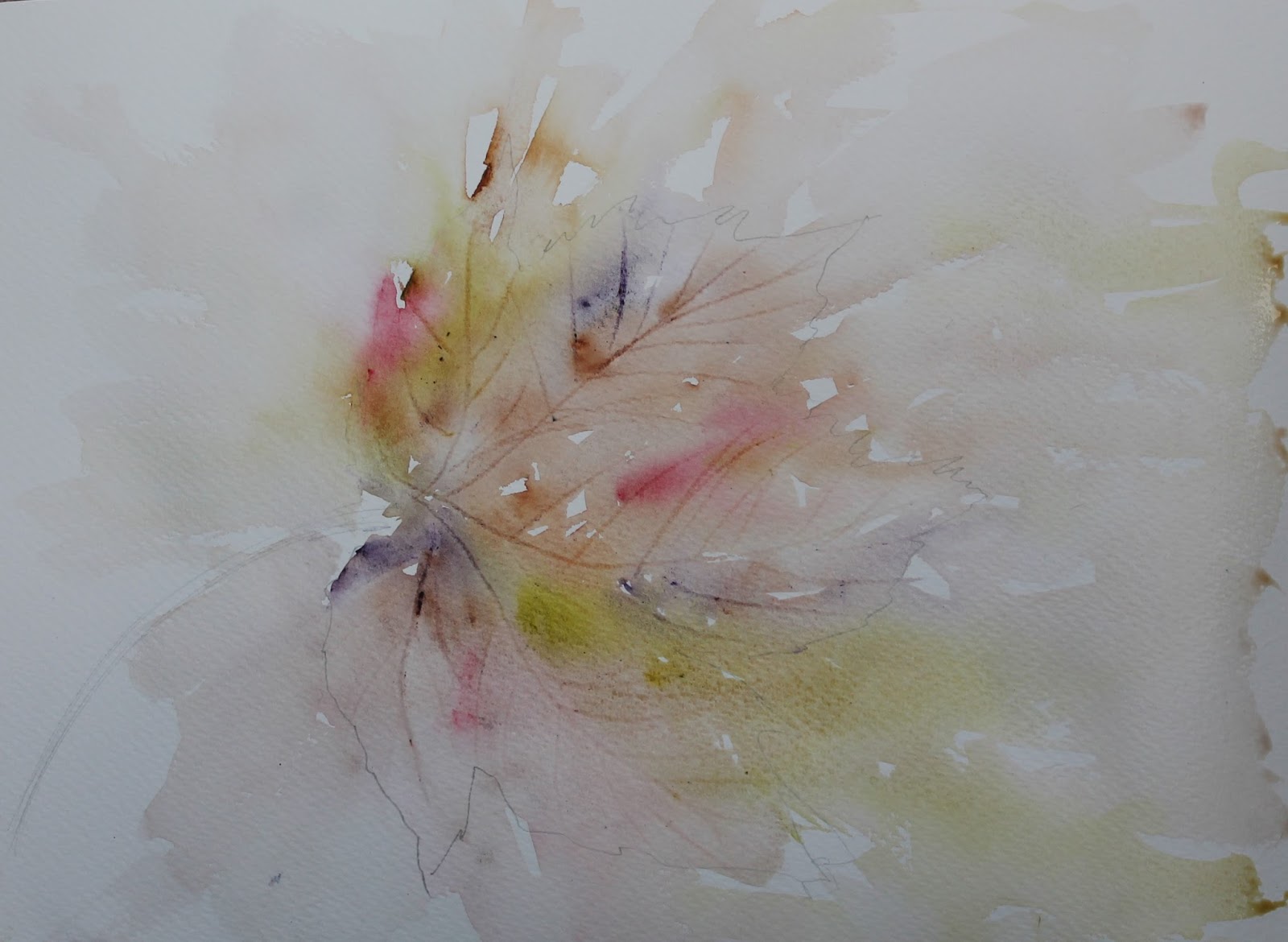
We arrived at the lovely little village of Moelfre mid morning and went straight for refreshments and bacon sarnies and then made out way onto the beach. The weather at this point was lovely and held for a couple of hours and I decided to do some little rock sketches as I remember that was where I struggled last time. This was my favourite and I used the colour scheme later in the holiday too

The weather then really turned. with thunder and lightening so we simply had to retreat to the pub, nothing else for it but not before I did a very quick sketch trying to capture the stormy atmosphere


 Joanne dressed for the weather!!


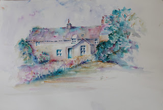
The plan for the following day was a stop at the cottages in Church Bay, North of the Island moving on to Camaes Bay so after a hearty breakfast Polly and I set off with our trusty easels and made our way there. They are a painters dream and Joanne wanted to paint some dilapidated cottages which I must say I also had my eye on but I was also interested in a shack which were conveniences at one time and I started there..

The shed was both corrugated iron and wood and I tried to capture some of the textures and the ramshackle nature of it.

I then moved on to the cottages and as Joanne was finishing her painting and I set  up behind her giving her a fright when she turned round!! This was my favourite painting of the whole time and I used the palette similar to the one for the rocks as I liked it and think it worked well.

We then moved to Camaes Bay where I have been before. the weather here was warm but dull so not unpleasant painting conditions in fact quite good for painting. One reason for painting in Camaes Bay would be the boats and Joanne did an interesting painting where she decided to paint a dark dramatic sky with just a couple of boats. I was a bit overwhelmed by all the vessels sitting in the harbour and couldn't see just where I was going to make a painting so decide to have a walk round and see if there was any other inspiration. I took lots of photos and certainly have enough material if I ever wanted to run a session on how to paint boats and eventually set up in the harbour and did some boat studies...I drew a few and then lost where they were as the tide was going out quite rapidly (this was a problem I had last time at Red Wharf Bay... I spent so long on the bg, the tide had gone out before I could paint the boat and reflections... you might think I would have learned!!)

Anyway these are my little studies

A very useful exercise to observe the reflections in real life.

Our last day was a new venue to the group...the Hidden Gardens and what a find that was... so many painting opportunities we were spoiled for choice. Organising a trip like this needs careful consideration, things like access, loos, refreshments etc and Joanne makes sure that everyones' needs are met at all the venues she chooses, so a lot of work and effort behind the scenes to make sure the holiday runs smoothly and everyone can make the best of the opportunities.

Joanne had her eye on a wonderful cottage in the grounds but I had spied a waterfall in the leaflet and really wanted to find that. I wandered down through the gardens and came across it but it wasn't a very suitable place to paint, it was a little too far away but I managed to get some photos then clambered over some rocks to get some a bit closer so a good opportunity and with a bit of artistic license the waterfall was as near to what I have been looking to paint as I think I could find.


In the meantime I had spotted a large house behind the garden wall... lots of difficult perspective lines etc but I quite fancied having a go at it so this is a WIP and I will probably complete over the next few days

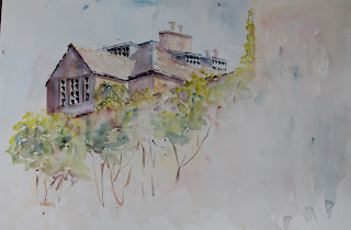
I think this image has some potential and I may well try again from the photo as it is a challenge trying to get all the roof lines correct and this was a quick drawing with a few wonky bits!! At one time I avoided anything which was difficult to draw, not because I couldn't draw it but because the minute I added the paint I would ruin it then have to start drawing again!! Thankfully those days seem behind me now and I do feel I have gained a lot from my plein air experience this year and am beginning to get a feel for it. I know Joanne does a lot of sketching in charcoal and ink, it really helps sort out a lot of problems before the painting and to then work from the sketches is the next best thing to working plein air and something I would also much prefer to do... my problem is the same old one, all I want to do is paint and I know she would be tearing her hair (or her) out with me reading this so I might have to make it a bit of a mid year resolution and try to do a bit more sketching!! Polly does a lot of Sketching with the Liverpool Urban Sketchers and is loving every minute in fact is preferring it to full painting at the moment... check out Polly's blog as she may also do a review of our time on Anglesey.

Ps What have I learned about painting en plein air this time? Well, the main thing is not to be a slave to the scene before you....we say it about photos why not about the scene in front of you so I tried to be a bit more adventurous with colour, moved a few bits and pieces, omitted lots (that one is really important) and to do more sketching.....