Friday, 5 September 2014

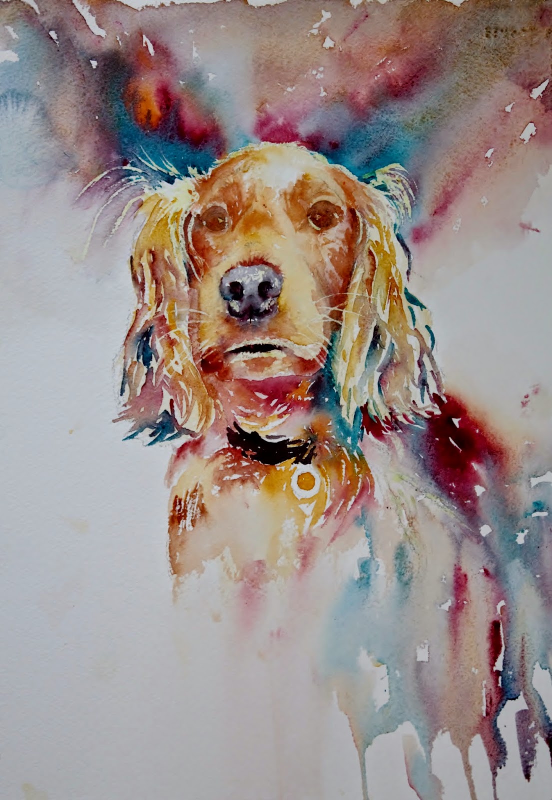
STEP by STEP.....Archie... our little Grandpup!!

Am hoping this is a new resolution... to make more step by steps!! So here is the first.

We have a lot of lovely photos of Archie (he is a very photogenic golden cocker spaniel and of course we aren't at all biased!!) but his "mum" Steph took this one... she takes the best photos of him and I really loved this one!!!

I had an attempt at painting him nearly 12 months ago but wasn't at all satisfied with the colour as I hadn't been able to inject anything different which is why I am a lot happier with this one.


I sketched the outline, positioning the eyes nose and mouth and though I don't normally use masking fluid preferring to reserve the whites I did pick out the highlights on this... his fur has blond highlights and I didn't want to leave to the end and pick out with white paint as there is too much.

First step of painting was to pick out the eyes and nose and add paint wet in wet to areas of the face. Little tip for both eyes and nose from Jean Haines is to let the colour bleed sightly into the face which helps to make them part of the face.
Next was to add the backround. the colours I have used are all W&N artists quality, the paper is Arches rough 140lb.

Colours  
                                                                                    
Pthalo Turq (this is a good rich colour which will give a good range of tonal value)                                        
Burnt Sienna                                                                                                                                               
Alizarin Crimson                                                                                                                                          
Raw Sienna
                                                                                                                                              
I tested the colours with a planet and decided the turquoise was a good addition to lift the colours to       create something a bit more unusual. The first painting I did was unimaginative as I stuck to the colours as I saw them so am happier with this palette.

The background was a mix of all 4 colours, added wet on dry and allowed to mingle on the paper. As I didn't want any green in this I tried not to place the blue next to the yellow. I also added a bit more detail under his chin and on his chest introducing some of the turquoise here and there. Where I wanted good darks I used the turq, aliz crimson and burnt sienna picking up almost neat paint mixed together on the brush.  There isn't really any magical formula as to where I add which colour other than I am always looking to add variety while keeping things in harmony.


Here I have started to build up the ears...... the paint has been applied with a drier brush so that I start to get the texture there rather than a smooth velvety look as on his face were his fur is much shorter.  I also work a little around his face trying to keep the edges soft where I can building up some depth of colour.


Next I added the collar, a little more detail to the eyes and a bit more building up on the face. Again there is nothing too scientific about how I move around the painting other than I make sure the paint is dry before I work in that area again.
                                                                                                                              
                                                
Here I decided to add a bit more background to the left.... might decide that doesn't look right but I have now committed to it!! I worked on his muzzle with some raw sienna and soften the areas below his nose.
 
As his face was now wet I darkened the background above his head which brings his head more forward and when dry I worked around his face. I also removed the masking fluid at this stage so I could work more around his mouth, nose and eyes.


I didn't like the mouth so worked on it a bit more here..I built up by looking at the tone on the image and adding the darks where I see them. I also lifted colour out above his left eye and between his eyes. A bit of work on his nose here too...I had used some masking fluid on his nose but it needed blending... often a problem with masking fluid as it leaves harsh lines and needs softening.


More work now on his ears and around his face.... at this stage it is the finishing touches which need adding and  I spend a lot of time just looking and often take photos as things often become clearer when viewed on screen. I worked more on the eyes and nose and it is often only a very tiny touch of paint here and there as I am trying to improve the likeness and fine tune the shapes. I have added a touch more to the bg to the right, again not sure about this area and feel it may need something else but I think I am going to leave it for the time being.


I left it overnight and after a bit more tweaking around the mouth  think I will be calling it a day!!


Hope you have enjoyed this... please feel free to ask any questions you have about techniques I've used, or anything you feel may not be clear, am always happy to help!!

Thursday, 21 August 2014

2014 all day Workshops

My blog has been really quiet recently but just so you know I haven't been sitting idly around!! I ran the first of my all day workshops at the Boonric Gallery last week but got so involved forgot to take any photos so was determined to remember yesterday!!

The workshop was titled "Loosen Up" your watercolours and was designed to help take the myth out of that loose style we all seem to want to achieve.

I have now been teaching for just over 2 years and I cannot tell you how the teaching has helped my own work... having to verbalise what I am thinking really helps crystallize my thoughts and helps me understand why I'm doing what I'm doing which can only be good for everyone else!!

I usually start my classes, with a run down on how (and more importantly why) I apply the paint to the paper... mixing on the paper and the brush, and it soon becomes very clear to everyone, with the exercises we do, why this way is more exciting and lively.....

We go on to show how you don't need the whole subject for people to understand what you are painting and then do some work on lost edges. I saw lots of light bulb moments in both these workshops... and many comments of how they had never worked this way before....

I demonstrate lots of techniques which when PRACTICED will help someone's painting improve massively... key word there is PRACTICE... remember painting is a skill not a talent but needs PRACTICE to develop!!! I try and show people all the things I was never shown... I think my tutors tended to assume I had this knowledge, when in reality I knew nothing and needed to be taught!! Lesson learned and in my classes I try not to assume anything. The other thing I didn't see much of in those early days was a tutor demonstrating... another valuable lesson for me... I demonstrate everything.... I believe it is much easier to see how someone does something than reading about it.

So the first part of the day involves techniques, tips and hints and then we go on to paint an image which helps put everything into practice.

You may remember I wrote a blog on how to use artistic licence with photos here and this was the image I used for these 2 workshops as it encompassed so many ideas I was trying to get across both in terms of technique and intent.

I explained that when I saw the image (supplied by Ruth Archer from Paint my Photo) I wanted to convey a completely different atmosphere which involved a sunny day and also I was not going to include everything. In my sessions when we are doing a painting I try to encourage the group to use different colours to the ones I am using and often get them to test a combination by using the colour planet idea.

Here are the paintings done by the group... they were all on this course because they wanted to lose some of the detail they were inclined to add and though they didn't all finish, I think they all did terrifically well and really embraced what I was trying to get across. I also need to add that not one person drew this image first... they all went straight in with the paint.. scary!!!


I feel so proud of them all when I see their work together here and have to say the previous group did an equally good job with their paintings too!! As a tutor, what really stands out is how different they all are!! I judge how successful a workshop is, not by how close they are to my work but how different it is!! What I try to do in all my sessions is give people the tools to work on their own, I teach a way of painting which I hope they can incorporate in their own work, in their own way and I encourage them to start by at least choosing their own palette.

In conclusion, I have already had one lady send this to me today......a painting she has done this morning where she has embraced the techniques and worked at it on her own.... how fantastic is that??? Look at this......this is what my sessions are all about, she has used all the techniques and integrated them into a different scene and produced a gorgeous piece. Seeing this,I know this lady has learned enough from the session to incorprate it in her own work... I am so delighted with this, she has done a beautiful job and am sure she is delighted too!!


Tuesday, 29 July 2014

More Hints on Colour Choices

I have had an online friend Leona Fraser for some time now (she is a very accomplished painter!!) and she has been incredibly supportive of my own work and art journey. I saw this image she posted of her wonderful dog Buster and decided it was a dog in waiting, that is waiting to be painted!!

I loved the composition as well as his soft trusting face so decided to paint him....

The main thing I think about with a painting like this is the palette I should use... as many of you will know I tend not to use more than about 5 or 6 colours in any one painting and still use my planets to get a combination I think will work. Check out this blog I did a couple of years ago which you might find useful.

I always like to use a rich dark, either indigo, ub, purple (usually winsor violet which is my favourite purple), perylene maroon and sometimes more than one dark... then I usually choose a yellow and a red and mix them on the paper to see what effects I get and whether I like the mix. Sometimes the combination needs a subtle change from say quin gold to raw sienna or vice versa. I don't always know what I'm looking for, it is often a process of elimination trying different mixes until I hit on something I think will work. However I could also choose an entirely different combination and still feel it would work!!

There is nothing special or requiring special talent in what I do it is simply a process of trying different things maybe choosing unlikely combinations which helps make the painting more unique but I can assure there is nothing more to it than just choosing some colours and hitting on a mix which I think looks nice.

Colours used in this

UB, winsor violet, burnt sienna, aliz crimson, transparent orange, raw sienna, but it really doesn't matter which colours I used I could equally have decided on prussian blue or indigo, touch of turquoise, permanent rose, that is down to personal choice and what might be an interesting exercise would be to do several paintings of the same subject using a different palette in each case!!

I did a quick sketch of this, it is important even when painting a loose watercolour, the drawing has to be accurate so I placed the nose and eyes then painted around them.

I would encourage you all to try different colours, just play with the paint and see what different combinations you can get, admittedly they may not be realistic but to me that is all part of the fun!!

Am delighted to say Leona loved this by the way!!

Saturday, 26 July 2014

Is this "en Plein Air"?

I have just returned from a fabulous time in Anglesey with a super group of painters from the North West. Joanne Boon Thomas organises this trip each year for 2 groups of painters one stay the first half of the week, the others the second half and we have all been blessed with the most amazing weather...the hotel was super with fabulous food (always a plus!!) very warm and welcoming.

Joanne invited me as she keeps telling me I need to get out and do some painting en plein air!!! I know she's right but I guess I have avoided it so far. I did go on a painting holiday to Umbria in 2006 and had a wonderful time and although my paintings left a lot to be desired I was voted best improver of the week so I was happy!! I haven't really done much plein air since I but do know it is another string I need to my bow.

So armed with my easel, a small traveling palette, collapsible water jug and equipment pared to the very bone (going against everything I hold dear!!) I set off first of all to pick up my pal Polly Birchall whom I had met once before on a workshop with Joanne. We had a good journey into NorthWales and then onto the island and no we didn't get lost once!!! Who said women can't navigate!! We chatted and pontificated none stop for the whole journey, setting the art world to right and our 2 hour journey passed in no time.

We arrived at the small town of Moelfre where most of the group were already settled and well on their way with their first efforts. I set up to paint what I realised was a difficult subject, not the house I was painting but all the rocks below... not a good idea, and certainly an even worse idea to attempt it again to try and improve!!

We met for drinkies back at the hotel, changed for dinner and then went on to enjoy our first fabulous meal. Early night for most and then off the following day to the wonderful Chateau Rhianfa. The group had been for the first time last year and must have behaved themselves as we were able to go again this year.. what a place!!! A painter's dream... so much inspiration, am now looking at deals to go and stay!!

The following day we visited Red Wharf Bay and painted there for the morning and after devouring our packed lunches Polly and I set off home. Before I go on to display the paintings and explain the reason for the title of this blog, I would like to take the opportunity to thank Joanne for organising what was a lovely trip and for getting me doing the dreaded "plein air!!"

This was a little Dovecote building in the grounds of the Chateau, hidden amongst the trees.  I tried to capture the lights and shadows which were falling on the building and was actually quite pleased with how this turned out... I maybe overworked it a touch but next time would go in with the deep tones sooner so that I avoided too many layers


The next painting was of the Chateau and what I had in mind was to capture the light rather than all the detail on the turret or all the foliage for that matter. I went in wet in wet, no drawing and avoided the side of the turret to the left which was bathed in light. I then added a bit of detail to the stonework, a touch of shadow and though  the piece may not be finished (it might need some rich dark foliage lower down on the left of the turret), I do like the light....


The final painting I did on location is again unfinished, done at Red Wharf Bay of some lovely little houses and a boat... problem was the tide went out before I managed to get to the boat and  lost the reflections as it ended up on the beach!! Again a bit overworked in the foliage department but so much learned!!!

Artistic license used in this to add the boat and include less foliage!!


And finally to my question!!

What I would like to know is.... if I painted the following painting in my garden this afternoon, having taken the original photo and already done a version once above, does it count as plein air?Am really hoping so!!! I think for the "purists" amongst you I would need to have done the whole painting in front of the actual subject but for those who may be a bit more liberal, the experience of fighting the elements (in this case, glorious baking sunshine) with a photo stuck to the side of my easel may just count!

I wanted to create a more complete representation of the same scene above including the foliage (aarrrgghhhh) and I might even do the same painting again but use a different colour scheme as am feeling this is a bit cool and some warmer tones might be needed.

So what have I learned....

Well first, to make sure if the tide is going out get the boat done first so that the reflectons are captured!!

Second, decisions en plein air need to be made quickly and it therefore helps to have a sort of template or formula for how to paint something, ie stonework, beach, sea, foliage, there are too many other things to be thinking about without wondering how to paint something in the first place... the rocks in my first efforts are a good point in question.

Third, you don't need to include everything... I think I am actually ok at that bit... anything which looks remotely tricky... leave it out, that's my motto!!! Vignettes are good for plein air (like the little Summer House) you just need to make sure you get the composition looking ok at the edges. So, not a uniform unbroken circle around your subject, more random and uneven.

Am sure I will have learned lots more but for now these are the areas I will be working on, I am on the edge of the Pennines, the start of the moors in Lancashire and we have Rivington Country Park on our doorstep... an area full of old stone buildings, doors, reservoirs,  derelict barns so there really is no excuse and I am hoping I have developed a few more skills to encourage me to get out there and give it a go!!

Wednesday, 23 July 2014

Ken Bromley Cover Competition

Ken Bromley is a company supplying art equipment all over the world via mail order and I have the added bonus of living a couple of miles away... believe me child in a sweetie shop has never been a more apt description!!

They produce a catalogue twice a year which is sent out (again all over the word) and their service is excellent! Every year they invite artists to submit paintings for selection for the cover on this brochure and I have entered for the last 3 years and have been shortlisted on each occasion.

This year I do have a good feeling about my entry but who knows?? This watercolour painting would be very different from their usual choice so I'm not sure if  that is a good or bad thing!!

This is the painting, done from a photo by Freda Austin Nichols on Paint my Photo


If any of you would like to vote here is the link and while obviously, a vote for me would be greatly appreciated, you might like to check it out and simply vote for your favourite!! Thank you!!


Friday, 11 July 2014

The Lonely Photographer


I have had this in my "to do" list for a while and as the photographer John Robinson is now adding to his series  "The Lonely Photographer", so thought I had better get going!!

I liked the light on this image plus the mystery and the thoughts of where he is going and where he's been.


As some of you will know I like back images especially of portraits...no need to worry about a likeness so I just had to decide on my palette for this one.

I knew I would need a good dark so I used indigo which I like mixed with alizarin crimson and a touch of raw sienna to give me an "almost" black... I wanted to capture the light at the end of the tunnel so went in with fairly pale washes to start with and built the tone later.  As you can see I added a touch of green to the darks to connect them with the greens in the distance. The walls of the tunnel were quite shiny in parts, not sure if they were wet anyway I tried to capture that too.

One tip is to photograph your work and view it on screen, it's amazing how areas you need to address become so clear.....with this the walls, floor and figure weren't dark enough.

If any of you would like to see more of John's work, here are his links

facebook
Website

John is also a member of Paint my Photo


Sunday, 6 July 2014

Rose Commission and Jean Haines influence

I have been asked to do a commission to present to a church committee for 3 paintings which will be displayed in their new entrance lobby... I have a brief and have been playing around with compositions of roses and crosses (will feature the crosses in a future blog) and think I have settled on a vertical "S" shaped composition.

I have sent this for approval and thankfully in principle they liked though we think it needs tightening up a bit

In the meantime I have done another this afternoon which I have tightened up and done in a different colourway inspired by a rose in our garden which is a very delicate shade of yellow and pink.

Not as drippy or loose but I still like it and like the formation and light on the roses... will be letting them have a look at this one too. The cross, which will be the centre piece with a rose painting either side, is causing me a few headaches but I think I know where I'm going with that now...

I have practiced lots and lots of roses and have been inspired by Jean Haines work and in particular this blog (as an aside Jean raises money for cancer research via this blog by asking those who use it to make a donation) which I have used to do many studies from. However I would like to think that I am now painting them in my own style... both these studies have been painted entirely from my imagination, with no reference to anyone else's work, BUT backed up with those hours of practice, getting to know the subject and learning just how to paint them in a way that suits me and my fast, bold brushstrokes!! I am not  known for subtlety but am learning to be slightly more delicate when the subject demands and that is something I have had to learn the hard way as your brush stroke is as individual as your handwriting and only by working and working on it have I learned to apply the paint with differing amounts of pressure.

As for the finishing touches, where to keep lost edges and where to add darker bits negatively, that also comes with practice, that and standing back, reviewing, sometimes taking photos and again, no two artists would add those touches in exactly the same place... they are as individual as the brushstrokes and partly what gives us our style... so, having been inspired by another artist I feel I am now on the road with my own work and while I will always follow Jean and her wonderful paintings I no longer use her as a crutch......something I am sure she would be delighted to hear as I know she is thrilled to see people she has helped moving on!!

Monday, 30 June 2014

Colour Thoughts

I know I mention colour in virtually every blog I write but thought a full blog on colour where I tie everything together would be useful. I get asked a lot about colour on all my workshops and I find as I progress I get more and more specific about what I want from a particular colour. Anyone new to my blog might be interested to read about the colour planets I do before starting a painting especially if I want to find a new interesting combination or I am looking for something specific which I feel will compliment the subject. What I am not necessarily looking for is to find exact colours to match my subject although I do that as well. I am looking for colours which may not immediately be what you might choose but because of the way I mix them will still look attractive.

I also choose a dark colour so that I have something which will give me a good deep tone... it isn't colour which defines a subject it is shape, and tonal value is what helps to give you the shape of a subject. My dark may be a blue, a purple, brown or sometimes a red but it has to be a colour which will give a full range of value so for example a palette with lemon yellow, permanent rose and cobalt blue doesn't have the very darkest values and so I would either swap a colour or add in another to give me the range.

I have spent a lot of time studying colour and am still learning and as you will have read do not keep my colours to a limited palette although for any one painting I rarely use more than 6 colours... I love having a good choice and enjoy all the different colours and particularly those which can't be mixed... W&N opera rose is a prime example... a vibrant almost fluorescent pink which is unlike any other colour and impossible to mix at least not with the colours I have. Schmincke Translucent Orange is another.... impossible to get from any red or yellow at least any that I have in my palette!!

I have listed the colours in my palette here, and I think I have only added a small number since, perylene green would be one, a lovely silver green, and interestingly I am realising that the more adventurous colour combinations come when I am painting animals....with flowers I tend to stick with matching the colour to the flower and maybe adding something a bit more adventurous for the backgrounds though invariably the bg will have some of the flower colour mixed with it. With animals I either see potential colour mixes or if  don't see them, I make them up testing them on a planet. I often work from B&W images for animals so I am not bound by the colour I see ... I find I can be a bit more inventive and creative if I'm not viewing the subject in full colour feeling freer to experiment with anything I think might look different and interesting.

Four colours I have been using a lot recently are UB, Permanent Aliz Crimson, Burnt Sienna and Raw Sienna... I seem to have been drawn to them for a number of paintings recently, I sometimes add in a prussian blue as well and a cad yellow for some brightness but am going to start experimenting again with some of the other colours. I really like Turquoise but don't seem to have used much of it recently so for no other reason I might introduce it into the next painting I do.... scientific eh?

One thing I do really want to emphasise is that although I really believe there are no rules for painting, there is no substitute for getting to know the colours you have in your palette, get to understand the tonal value they will give you, learn how they interact with other colours, and it can only be done with practice... it's fine to read all about them, about analagous, harmonious, complimentary colours, opaque colours, transparents, staining but reading and doing are two different things and the only thing which will give you a understanding of your colours is to use them!!

One example to illustrate the point is a colour called Winsor Red... a rich red, veering slighty more towards pink than cad red... I have used it to paint the red shoes both for the shoes and  bg. When I come to add it on the paper to mix with the prussian blue or indigo, whichever blue I am using it explodes and takes over, pushing the blue away quite significantly. For that reason I now know I have to go easy with it when mixing with other colours if I don't want it to take over, other colours do this but non as pronounced as the Winsor Red. Granulation is also another property colours may have but it is so much easier to remember it when you see it happening rather than just reading about it, easier to see how an opaque colour can both lift or dull a painting depending on how and when you use it, easier to see how much livelier colour can be when mixed and mingled on the paper rather than in the palette... seeing is believing!! So get your paints out and play!!

Saturday, 28 June 2014

She must be a Contortionist!!

I have had this photo for a while (Freda Austin Nichols on PMP) and have kept looking at it wondering how to go about it and decided to have a try this afternoon. I wanted to stick to the wet in wet process but this caused me some difficulty as there were certain things I wanted to capture in this image, mainly the light (or dark) and I found I was keeping most of the edges as they all seemed to have a purpose which in my mind enhanced the painting... it may be that in the future I will try a completely different approach, but a more literal one seemed the way forward for this particular piece...

As always I used a limited palette

UB
Prussian blue
Aliz Crimson
Burnt sienna
Raw Sienna

This palette seems to be one I am using a lot at the moment, unless I am doing flowers,  I do like the way both blues interact with Burnt Sienna and I find the addition of Aliz Crimson and Raw Sienna make for a more colourful feel.

I did a drawing first, as you can see it is not a pose many of us could ever have struck or even contemplated so I wasn't at all convinced I would get it right without some guidelines!! I do love ballerinas and enjoy painting them and the wet in wet approach seems to really suit them.

When I thought this might be finished and I looked at it for a while, I decided maybe, wrongly that it needed some shafts of light from the left... now I am not sure about them but I still prefer with than without


When you work with the paper so wet, it is very difficult getting the timing right and I am finding I am going in too soon... the paper was still very damp after about 45 minutes this afternoon and as I wanted to add some harder edges, I eventually dried it with the hairdryer. This degree of wetness isn't like just doing a sky wet in wet and dropping some paint in, the whole paper is sopping wet and water and paint dribble from it. I wet the front, back then front again as if I was preparing the paper for stretching and then of course more water is added as I start to apply the paint. How wet the paper is, determines what concentration of paint you need to use, depending on what effect you want to achieve... if that makes sense!! Those of you who follow my blog will know that I am trying to understand how this works and put it into words so that I can eventually teach it. At the moment I rely on having a "feel" for when is the right time to go in but that isn't something I can easily convey to other people so a bit of understanding of exactly what is happening needs to crystallize in my head happen so that I can explain it... phew!!!


In the meantime here is another wet in wet I did a few days ago from  photo by Rob on PMP, another atmospheric piece with the same palette and an intent of capturing light. I went in far too much before the paper was dry enough so the paint kept bleeding into areas I wanted to keep sharp and even though at this stage lifting out is still possible it sets the painting back and of course means you are working on it unnecessarily... never a good thing!!

I think this needs a bit more blending of the bg both into the yellow area to the left and into the water as I feel there is too strong a division between the bg and the water but that is easily done and in actual fact only became clear as I viewed it here!! Amazing what becomes so obvious when you see on the screen!!


Saturday, 14 June 2014

New Challenge.....Another Black and White Image!!

I have had this image stored for a while from PMP (am afraid I can't find the photographer to credit so have asked on the site if anyone knows who it is). I saw a graphite drawing of it and thought it would translate really well to watercolour... this is the original reference. Black and white images are so good for seeing tonal value and if you have trouble in this area I would advise you all to get into the habit of transposing images to black and white...it also helps you choose your own palette without influences from a colour image.

So, here is another example of not having to be a slave to the reference, what we need is to look at is tones.... the colours can be whatever we want so we need to choose something which will give us a really good dark and the rest depends on how colourful we want it to be.

Two of my favourite colours mixed together on the paper are Burnt Sienna and Prussian Blue so a I decided on those for the coat and a mix of Cobalt Blue and Indigo for the jeans. I used a touch of Alizarin Crimson for the bag but apart from that used only the blues and brown. I could have used any colours at all, I was only looking at lights and darks not colour and maybe on a different day I would have chosen an entirely different palette.

With an image like this it is a good idea to keep the lightest lights white even though we can see there are no real white areas. Keeping a few whites really enhances a painting and lifts it so you will see there are a few whites left on his hat and jeans and odd little sparkles around the painting.