Showing posts with label step by step. Show all posts

Saturday, 31 March 2018

Butterfly Step by Step

First I painted the flower and then lost most of the edges into the background. However as you can see I keep some edges...if you lose all the edges all you would get is a yellow wash...losing some of the edges keep some of the form of the flower and also lets me see where I am going.

Next I have painted the butterfly..I haven’t drawn any of this (I draw with the brush) and I worked on the body first then moving on to the wings. When you are painting like this you aren’t looking for a photographic representation of the actual subject, you are looking for a feel of it and I don’t mind if you cannot tell what species of butterfly it is I am more concerned that you simply see it is a butterfly. I have painted the butterfly in exactly the same way as the flower though I haven’t lost any edges on the body. 
I have added a bit more detail to the flower and butterfly, added a touch more colour top left above the flower and done a bit of splattering around the bottom edge of the butterfly.... Colours used, W&N cad yellow, quin gold, burnt sienna and purple, DS transparent pyrrol orange, 15x11 Arches 140lb rough.
There will always be a debate as to whether or not it is finished and my view is that I don't want to work on this any more as too  much fiddling will result in loss of spontaneity.


Thursday, 6 October 2016

Step by Step Autumn Leaf in Watercolour

I am running an all day Brusho workshop (Autumn leaves and florals) a week next Tuesday so I am really hoping the leaves will have fallen by then and we will have some gorgeous colours to paint.

However, I am not too hopeful.... we do have fallen leaves in the area but they are all still green, with some turning slightly yellow so rather disappointing display at the moment....never mind, we will just have to "make it up" as I have with the colours on this step by step.

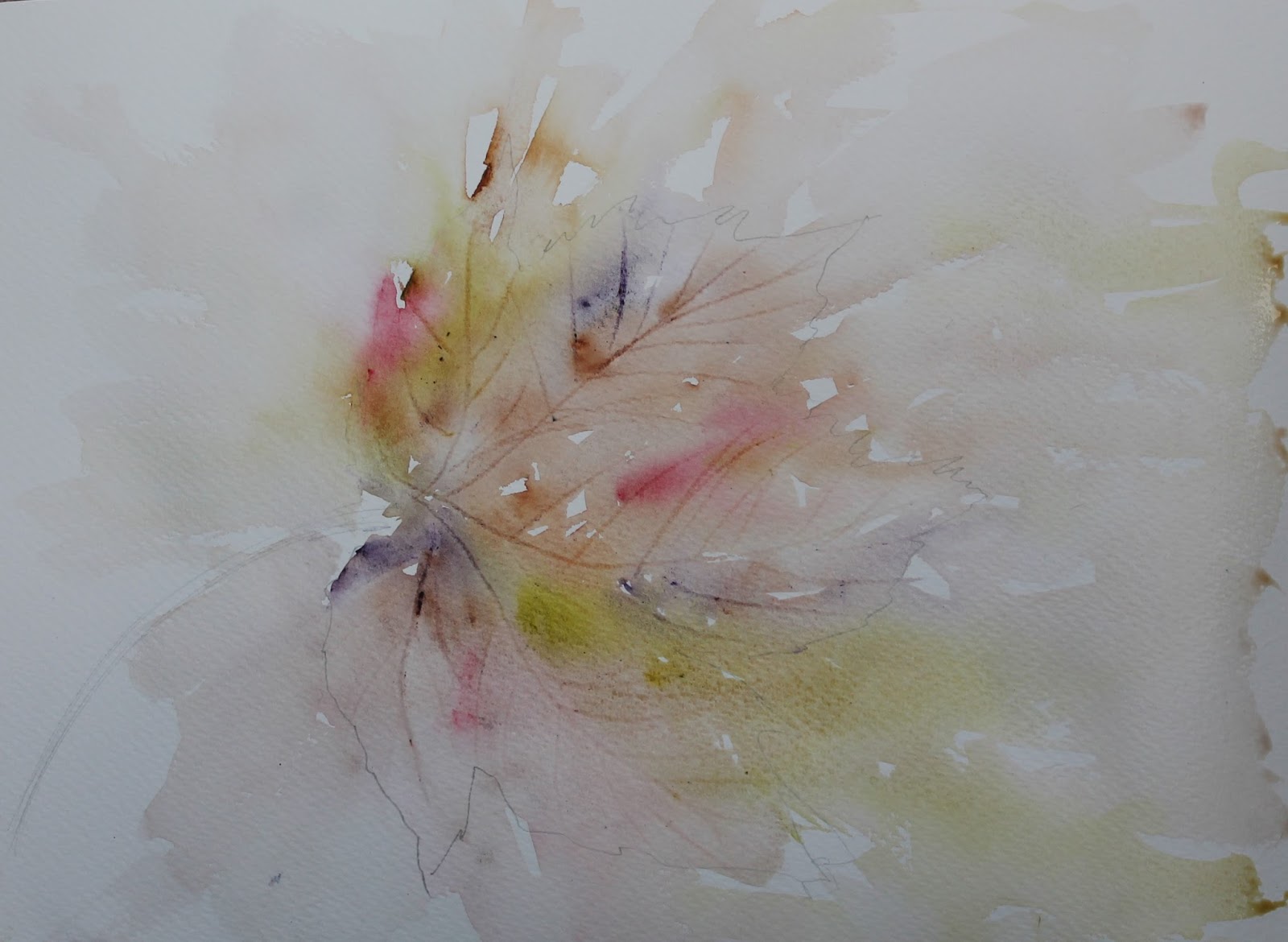
My leaf was still green so I just used it as a template for the shape and drew around it. In my classes I find this is the easiest way for the students to get a good result. Sycamore leaves do have a distinctive form and if they try to draw freehand they may not get the proportions quite right and even if they then do a fabulous painting they will still be disappointed with the final piece as the drawing wasn't right on the first place.

The colours I chose for this were Alizarin Crimson, Green Gold, Burnt Sienna and Purple

Colours all mixed on the paper, plenty of water, edges lost into the background and with my finger nail I have scratched in the veins. Then left to DRY!!


Now I can start to add some hard edges around the leaf so as you can see some are positive and some are negative with still plenty of lost and some soft edges too. The key to painting like this is not to add too much all at once and even where you do add an edge it is still possible to break the line you have just added. It is also possible to lose your edge completely if you feel you have added in the wrong area. Bit of splattering to the right of the painting... always helps to create a loose feel. Now I leave to DRY.


Next I have just worked in the centre adding a bit more paint to the body of the leaf... guess what, yes leave to DRY.


Here I have started to add a few more edges and this is where it is really difficult to verbalise how you should go about it. I have added a positive edge top right, slightly broken and added a negative edge just below right of centre. I have also darkened around the stem. I am trying to create the form of the leaf without adding every edge and and there is no right or wrong to doing this. If you want to create light then you will need fewer edges and then just faint ghostly ones. But if I was doing a full piece I would take time to assess what the painting needs and usually I place them on my sofa so I can see them both close up and from a distance and bit by bit it tends to become clearer where the composition needs work. This is also where it becomes difficult to say when the painting is complete and that varies greatly from individual to individual and again there is no right or wrong.


Here I have darkened around the centre of the leaf where the stem meets it and I also felt it needed a touch more paint where I had added the negative purple paint mid right (where you can see it is still wet) and I have also added a few more splatters. I think I will leave it there, I could work on it for hours yet adding more and more paint but I'm not sure if I would improve it and again if I wanted to do a "proper painting" I would still leave it now and maybe look at it again in the morning.

Just by adding little touches here and there, there is far less risk that you will ruin your work... it is when you go in heavy handed doing too much at once that you may take the piece beyond the point of no return. Here any little edge I have added can easily be both extended if I like or washed away quickly if I feel it doesn't work.

Would appreciate any comments to let me know if you feel that this has been explained well enough and has helped... would also love to hear if any of you have a go!!

Saturday, 27 February 2016

Snowdrop Step by Step

We will be trying this at my group next time, I took the painting not quite finished to show them at the last session so although some of the chaps aren't too keen on flowers there is a lot to learn from this one and it may well take us 2 sessions to complete. I used a composition similar to my previous Brusho snowdrop but to be painted in watercolour.

As this was painted as a workshop piece I did a simple drawing first....not all the group would be confident in painting without drawing and I have to cater for all abilities.  I have used a reference photo but only to give me some flower head shapes, not to provide the composition. I used the new Maimeriblu colours and as usual a limited palette,  Turqouise, purple and cad yellow to start with but thought that was a bit too much so changed to lemon yellow.

The first image show the washes. I have tried to keep things light around the flower heads as I know I want them to be fairly white. By guiding the water around the petals (paint will only flow where there is water) the paint will also flow around and leave areas of white. I start at the top with whichever colour takes my fancy then add paint straight from my palette, (sprayed with water before I start to make them moist and workable) alternating the colours in an irregular way diluting and spraying as I go along so instead of creating a wash in my palette I create the wash on the paper. As yellow and purple are complimentary colours (and could make a grey duller colour) I try not to add them next to one another.

This needs to dry completely and as I was in my studio  and my hair dryer was ready to go, once the shine had gone off (if you dry before, the water moves the paint around too much and if you have any particular effects you see happening they will be lost) I dried off ready for the next layers.

2nd image.....Here I have started to add a bit of detail working around the painting so that I am not working where it is wet, adding the stems and calyx's (think that's the right word?) and a few leaves at the bottom. Everything is still fairly light at this stage and I haven't added any more to the background.


3rd image below......I decided the light was coming from the right so started to darken the bg to that side to emphasize the counter change with the white petals. i worked around the main flower and as I add the intense colour I wash away behind it so that it can blend into the washes I already have.   


4th image below......Here I have started to work around the other flowers and added a touch more detail to the foliage at the bottom. I thought the bg was a bit too harsh behind the top flower so washed the intensity away. 


At this stage the whole piece wasn't "popping" as I would like so I left for a couple of days and then worked on it a bit more.

5th Image below......just a few subtle changes here adding a few more darks around the petals and in the foliage at the bottom. As you add the paint, as mentioned earlier, you need to wash the colour away with clean water into the bg... that way you don't add more wash into the colours you already have and you don't get hard edges where you have added the extra colour. I have also added a teeny touch of white guoache to the stems... not too much as it starts to look too contrived and I wouldn't have added any had I managed to keep more of the white paper.


Please feel free to ask any questions and I will do my best to answer.....


Monday, 27 October 2014

Another Doggy Portrait Step by Step

I met a lovely lady during one of my workshops and she asked me to do a bit of tuition with her, and even though she is a very good painter without my help,  she wants to learn watercolour and loosen up a bit.

I went to her house where I had the privilege of meeting Jenny, her lovely little dog..... a dog in waiting (to be painted that is!!) I asked Linda to send me some images and loved this one which has a quirky tilt to her head and shows her personality perfectly. 

So here is another step by step... seem to remember to do the doggy ones and another white dog too!


A loose drawing just to get the nose eyes and mouth in the right place and a little paint applied and bled out to the surrounding areas... colours used

Burnt Sienna
Permanent Rose
Raw Sienna
Indigo

As many of you will know I don't always draw but with commissions I do generally do a sketch to get the features in the right place.....if I am painting for myself, and I don't get a good enough likeness, there is no-one to check it but obviously when the owner will see the painting of her pet, it has to look like her pet!!

While the face is drying I add some background, here you can see the colours used and mixed on the paper, this will be darkened as the portrait progresses but also helps me get some shape into the composition at this early stage. I can see on here that the nostrils aren't quite right but that can be lifted at a later stage.

A bit more detail added to the right eye and nose and under her chin. I am keeping as much of her white as possible at this stage and will add shaded areas as it progresses. I work on areas as they dry so I am often working on another painting at the same time. Too often a painting is spoiled because we don't wait for the paint to dry... a sure recipe for mud (see  my blog about mixing mud here)

More work on the eyes and nose, background darkened and collar added in. Also added a bit more of her body but washed most of that away as I don't want the eye to be led there.

Can see the edge of the background at the top is too defined so will look at that....

So softened the diagonal edge and started to add more tone to the face, adding areas of paint where I see tone on the photo, softening edges as I go. I have worked more around the eyes and added a few highlights with white gouache both in the eyes and for some fur around the nose and mouth. I have added a touch of detail to the left ear but washed away so it is just a hint. Can see an area, left of her chin which doesn't look right and when I check the image can see I need to bring the shape round a bit.. the wonders of technology, seeing on screen makes these things stand out so much more.


Also added a bit more around her collar... hope she likes!!


Friday, 5 September 2014

STEP by STEP.....Archie... our little Grandpup!!

Am hoping this is a new resolution... to make more step by steps!! So here is the first.

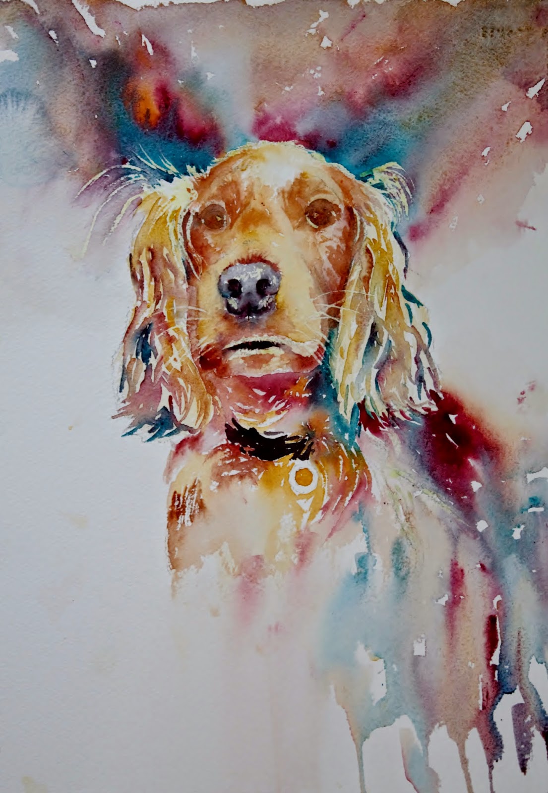
We have a lot of lovely photos of Archie (he is a very photogenic golden cocker spaniel and of course we aren't at all biased!!) but his "mum" Steph took this one... she takes the best photos of him and I really loved this one!!!

I had an attempt at painting him nearly 12 months ago but wasn't at all satisfied with the colour as I hadn't been able to inject anything different which is why I am a lot happier with this one.


I sketched the outline, positioning the eyes nose and mouth and though I don't normally use masking fluid preferring to reserve the whites I did pick out the highlights on this... his fur has blond highlights and I didn't want to leave to the end and pick out with white paint as there is too much.

First step of painting was to pick out the eyes and nose and add paint wet in wet to areas of the face. Little tip for both eyes and nose from Jean Haines is to let the colour bleed sightly into the face which helps to make them part of the face.
Next was to add the backround. the colours I have used are all W&N artists quality, the paper is Arches rough 140lb.

Colours  
                                                                                    
Pthalo Turq (this is a good rich colour which will give a good range of tonal value)                                        
Burnt Sienna                                                                                                                                               
Alizarin Crimson                                                                                                                                          
Raw Sienna
                                                                                                                                              
I tested the colours with a planet and decided the turquoise was a good addition to lift the colours to       create something a bit more unusual. The first painting I did was unimaginative as I stuck to the colours as I saw them so am happier with this palette.

The background was a mix of all 4 colours, added wet on dry and allowed to mingle on the paper. As I didn't want any green in this I tried not to place the blue next to the yellow. I also added a bit more detail under his chin and on his chest introducing some of the turquoise here and there. Where I wanted good darks I used the turq, aliz crimson and burnt sienna picking up almost neat paint mixed together on the brush.  There isn't really any magical formula as to where I add which colour other than I am always looking to add variety while keeping things in harmony.


Here I have started to build up the ears...... the paint has been applied with a drier brush so that I start to get the texture there rather than a smooth velvety look as on his face were his fur is much shorter.  I also work a little around his face trying to keep the edges soft where I can building up some depth of colour.


Next I added the collar, a little more detail to the eyes and a bit more building up on the face. Again there is nothing too scientific about how I move around the painting other than I make sure the paint is dry before I work in that area again.
                                                                                                                              
                                                
Here I decided to add a bit more background to the left.... might decide that doesn't look right but I have now committed to it!! I worked on his muzzle with some raw sienna and soften the areas below his nose.

 
As his face was now wet I darkened the background above his head which brings his head more forward and when dry I worked around his face. I also removed the masking fluid at this stage so I could work more around his mouth, nose and eyes.


I didn't like the mouth so worked on it a bit more here..I built up by looking at the tone on the image and adding the darks where I see them. I also lifted colour out above his left eye and between his eyes. A bit of work on his nose here too...I had used some masking fluid on his nose but it needed blending... often a problem with masking fluid as it leaves harsh lines and needs softening.


More work now on his ears and around his face.... at this stage it is the finishing touches which need adding and  I spend a lot of time just looking and often take photos as things often become clearer when viewed on screen. I worked more on the eyes and nose and it is often only a very tiny touch of paint here and there as I am trying to improve the likeness and fine tune the shapes. I have added a touch more to the bg to the right, again not sure about this area and feel it may need something else but I think I am going to leave it for the time being.


I left it overnight and after a bit more tweaking around the mouth  think I will be calling it a day!!


Hope you have enjoyed this... please feel free to ask any questions you have about techniques I've used, or anything you feel may not be clear, am always happy to help!!

Tuesday, 19 February 2013

Step by Step.... Pinks?

As promised have been working on my flowers from life again this afternoon and have managed to get this step by step together. I still can't get into the habit of photographing everything in stages so do lose opportunities to share how I go about things... sorry all!!!

These are the flowers I have been working from but as you will see, I use lots of artistic license and the final study is nothing like really!!


I add a few random marks for the first flower head which I place in the focal area top right.

While it is still wet I drop in more water so that the paint and water mix and spread on the paper.

I add 2 more flower heads as again add water to let them mix on the paper so that all I have at this stage is a rather crude impression and a vague shape. I also try and do each head a slightly different shape and face a different direction to add a bit of variety and interest.

Here I have added a touch of yellow and blue to create the base of the flower and some of the stems and at this stage I don't worry about whether the flowers are dry as I don't mind the pink mixing with the greens and yellows

While the paint is still wet I wash away some of the edges..... I know this is going to dry quite a bit lighter and will help how my flowers sit in the bg. Now I let it dry.

I have tried to show a technique with this image which is a really good technique to learn and will help your work improve if you can get the hang of it. In the first image you can see I have added some think pink/red paint but as you can see it has dried with thick unattractive hard edges. I have added the paint in exactly the same way in the second image but have gone back in with clean water. The water dilutes the paint but if you tilt the paper in the direction you want the paint to flow you will get edges that are much finer and look far more like delicate flower petals. it is a good technique to use on stone and brickwork as well rather than adding straight hard lines. Practice this until you can get it looking right and it will really help the appearance of your work.

Before you all shout at me, yes this is a different piece as I had forgotton to photograph a couple of steps!! Here I started to use the technque I've described earlier and slowly begin to build up the petals. I do this fairly randomly as they are not uniformly placed and again adds to the variety.

You can see more clearly on this one as I have left the lines before I have added the water.


Back to the original    have called it a day with this but I could go back in a work on the flower heads a bit more yet and add a few more darks under the petals but for the time being, I think you can see the flowers have appeared and are giving the impression I want. Now it's a fine line between overworking and stopping...... better to stop and leave for a day and as I am beginning to learn, once you step back sometimes it becomes more obvious what, if anything, you need to do to add those very important finishing touches.

Hope this makes sense and you have enjoyed, but more importantly will give it a go yourselves and please do let me know if you need any help understanding anything.. I know what I mean but that doesn't mean all of you will!!!


Monday, 9 July 2012

Flower "Step by Step" Loose Watercolour Painting

I've been asked to do a video on how I did the clematis but sounds a bit technical so thought a step by step might "break" me in before I go for the filming bit!!! My friend Susan Hall and I were chatting and she wanted to give this flower a go, we have been on-line friends and painting buddies for a good while now and the whole "loose" thing started with Susan so I have a lot to be grateful to her for....

This is the image Susan chose (one of Suzanne Wallick's lovely photos on Paint my Photo ) and I have to say wasn't sure how to begin. I thought I would start on the centre at first, then decided to do a full wash instead
Used opera rose, ub, may green, permanent rose, dash of green gold, paper is 20"x25" 200lb Hahnemuhle, so slightly smaller and squarer than full imperial. The biggest I have ever done!!! Tried to keep the pink/purple shades to the outside with darker shades in the centre. Now what to do next.... well first it needs to dry and then am going to try and do a mix of positive and negative painting defining some of the petals but by no means all but not sure at this stage where to do that..... exciting eh?


Thought I might be losing it here, kept going in before it was properly dry.... am always telling other people not to do that but I get carried away!!! Anyway I add paint then wash it away by adding clean water to the darker paint so that I don't get hard lines (you may notice the bg to the left is slightly lighter than the first photo.. that's because it had a hard line as it dried so I washed it away) and also let the colour bleed into other areas so that hard lines are kept to a minimum. I have made a mistake with the paper, as I had forgotten it has both rough and smoother sides and I have used the smooth for this whereas I much prefer rough.

Starting to see it now and I liked the "unfinished area to the left so decided to keep something of that as I continued to add some of the detail around the centre of the flower. Just kept adding a mix of darks both negatively and positively and washing away to pick out some of the petals. At this stage I was using some violet to give added depth to the darks. Another note about letting the paint dry, as I work on each area and wash away the paint I need to let each of those areas fully dry before I even think about going in again, otherwise mud will happen before my very eyes!!!
This is where it got trickier, deciding where to lose the flower head so I had a few goes and think this looked the best, at this stage it really is a case of keep stepping back to observe from a distance and tweaking it until it looks right to you. At this stage I also added a touch of chinese white for some highlights in the centre.

So that's the first step by step I've done, I usually forget to do the photographs in between but disciplined myself for this one. Would be very interested to hear your comments about whether you found this useful and would also be very happy to answer any questions you might have. Just leave me a message here or by e-mail and I will get back to you.